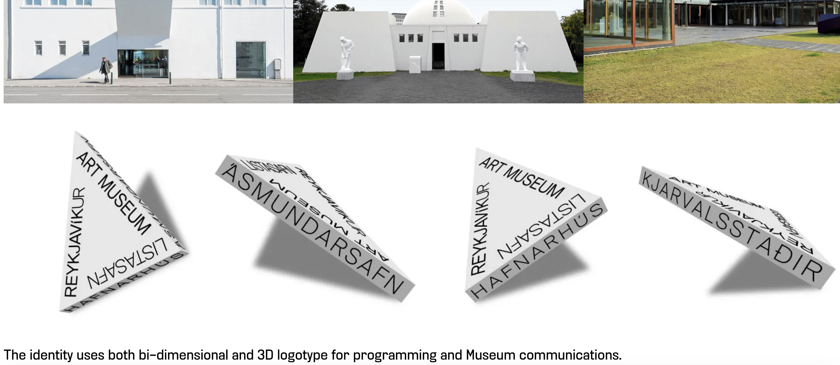
The internationally renowned design and idea studio Karlssonwilker needed a new website. The current site had a disjointed and confusing user experience that undersold the accomplishments of this extremely influential studio, whose award-winning work for clients like Bloomberg, BMW, and Nintendo has set new standards for graphic design and branding. I led the creation of a platform that offered a simple and accessible path to the studio’s multi-faceted projects and guided the user through sometimes complex, always original, design ideas.
What I did:
- Content strategy & creation
- Brand strategy & voice
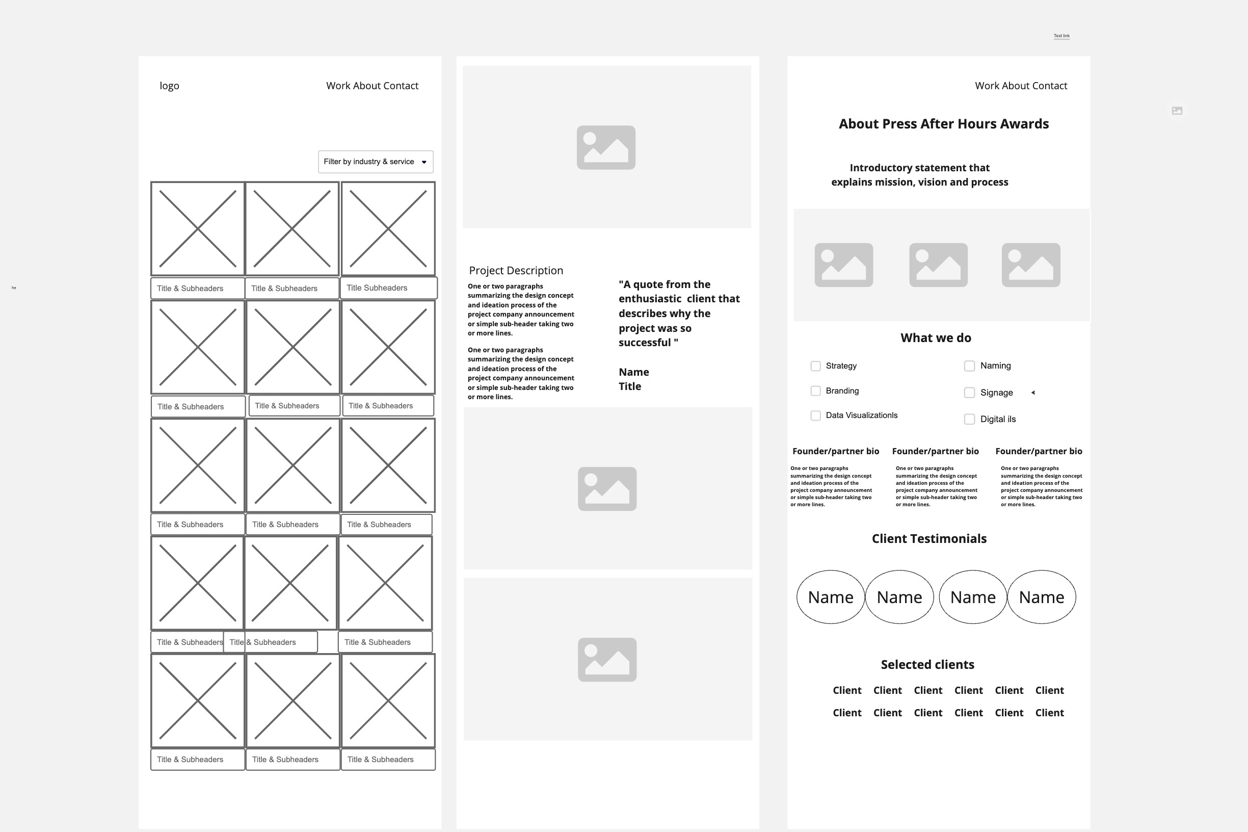
- Content architecture, wireframes & sitemap
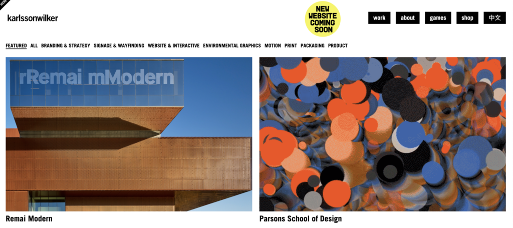
The website before
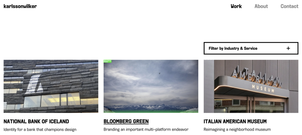
The website after
Articulating a strategy
One of the main challenges was to appeal to the diverse profiles of the studio’s prospective clients. We needed to convince stakeholders ranging from influential creatives to fine art tastemakers to data-driven marketing professionals, each with different commission objectives and selection criteria, that Karlssonwilker was the right studio for the job. We solved this challenge by sequencing information in an intuitive and practical content asset hierarchy.
Shaping a multi-layered experience
We structured the content in three layers: introduction, discovery, and immersion. The introductory layer was designed to be highly scannable. We wanted to grab the user’s attention and make an impression on them with as few words as possible. For this, we used a “show don’t tell” strategy where we put the work front and center on the homepage in a large grid of project thumbnails instead of crafting hero banners with lofty statements. Light and digestible subheaders give the user an immediate sense of the project’s scope and concept.
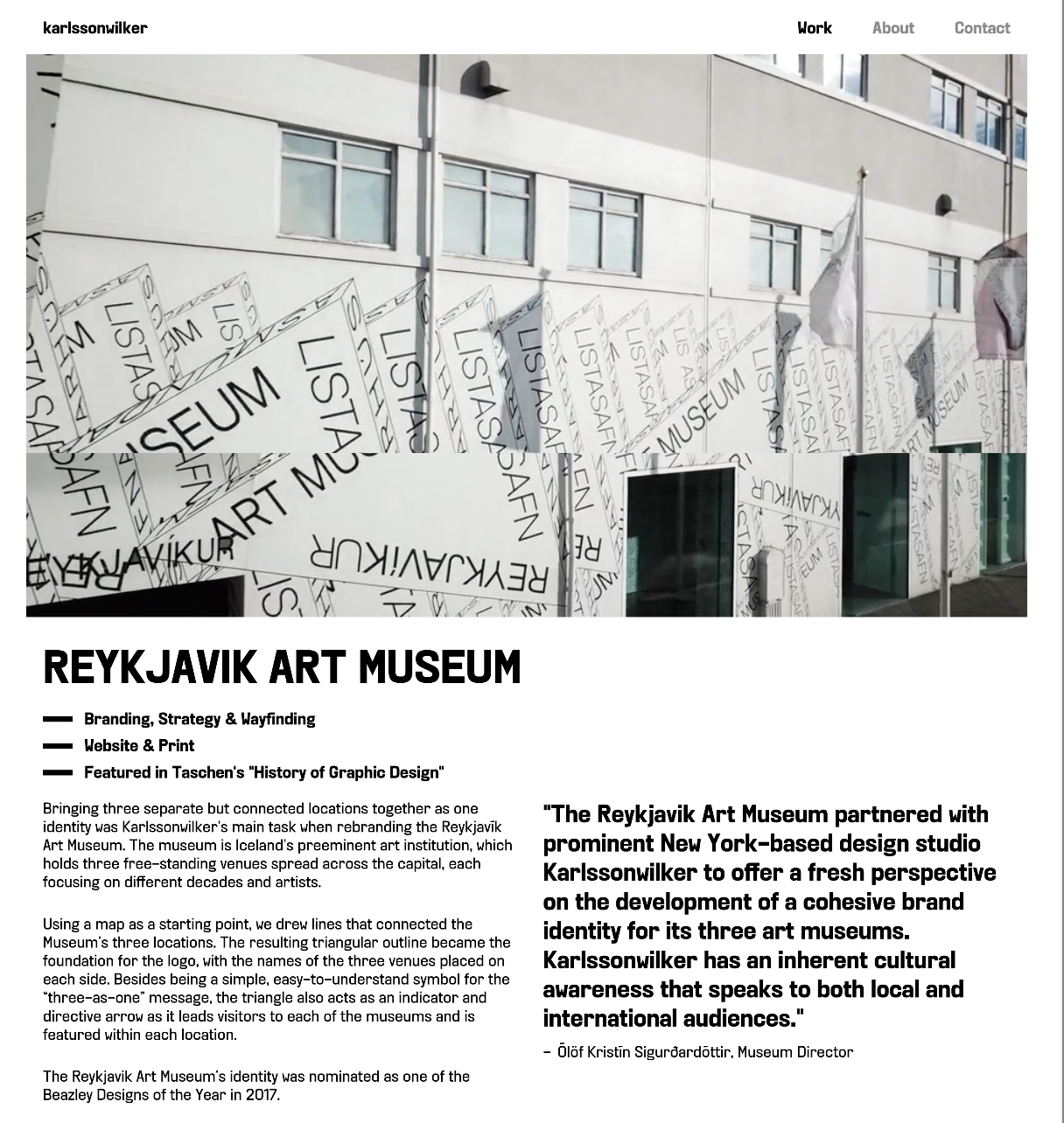
For the case studies, we opened with a page with large full-bleed images and a client testimonial that packed a two-fold punch by both describing the project’s successful outcome and articulating Karlssonwilker’s unique skill and talent.
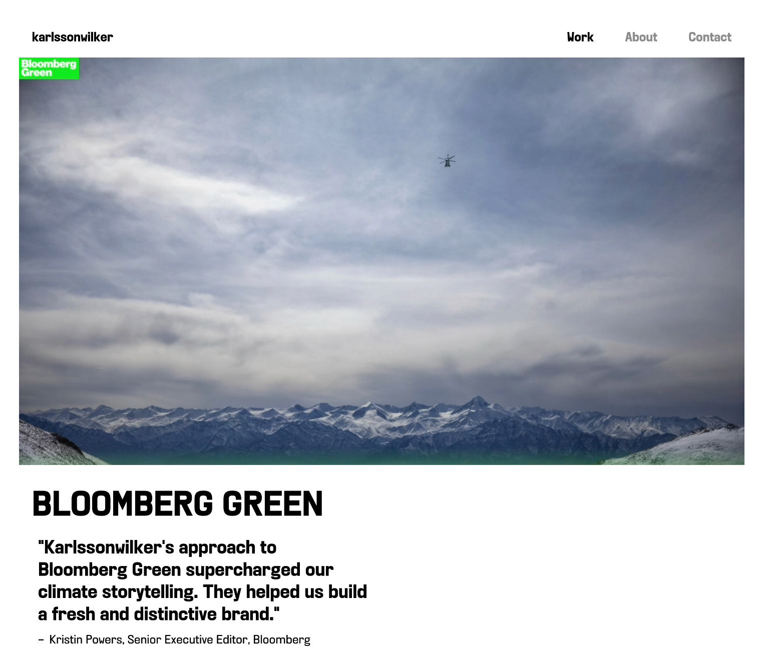
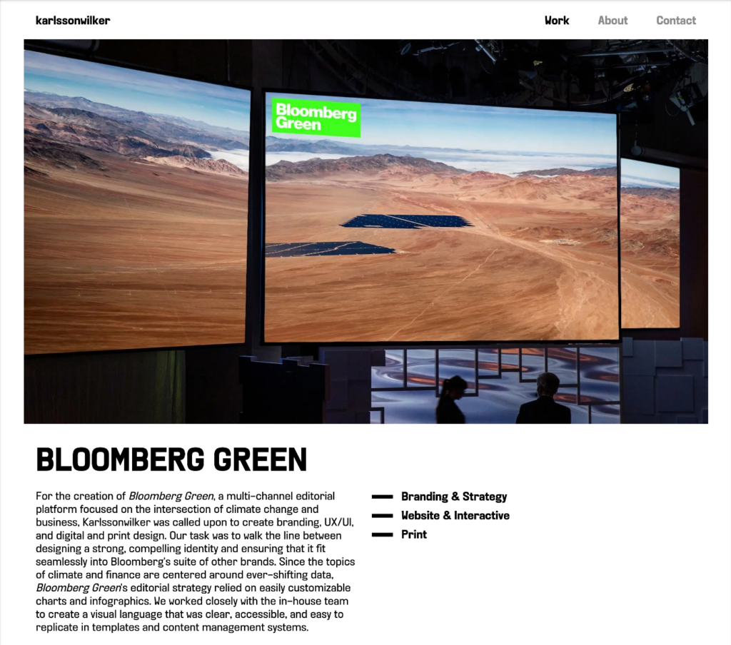
The next layer was discovery, which was designed for the user who wanted to know more about a particular project without getting bogged down with endless scrolling. After scanning the introductory page, the user can choose to learn more on a secondary project page that features a summarizing paragraph that captures the larger story behind the design’s purpose and ideation. It also lists the scope of services and the occasional fun fact about the project.
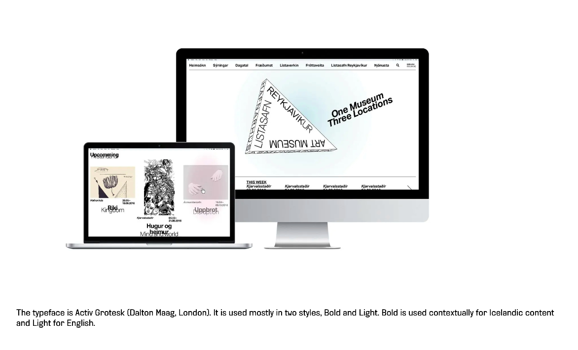
The immersion layer, meant for the design-savvy prospective client who is interested in digging into the studio’s process and methodology, allows the user to dive deeper into the project by browsing videos and detail images with captions that expand on the many aspects of the project.
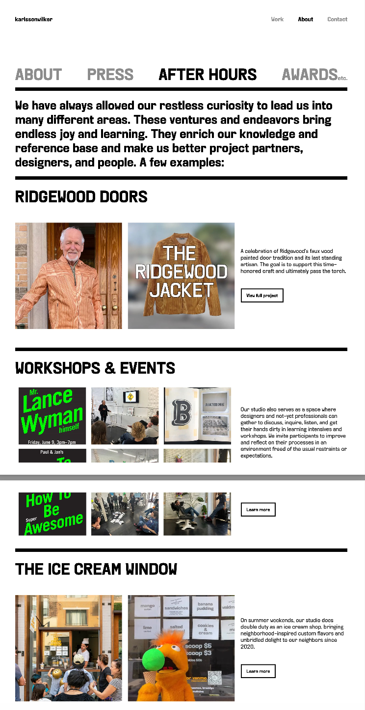
Besides working clent commissions, Karlssonwilker is also involved in a host of multi-disciplinary endeavors such as clothing lines, community workshops, and a popular ice cream pop-up shop with original flavors. Previously, these passion projects have been buried on separate platforms with their own urls. We needed to bring them onto the same platform as the client work in a way that seemed cohesive and complementary.