During my tenure as content director for the AI-driven automation SaaS platform WorkFusion, I was responsible for the company’s rebranding and website redesign efforts. Leading strategy, brand voice, and content architecture, I worked with the digital agency Athletics to transform a disparate platform of disjointed product information into a cohesive user journey. The form language and accessible tone of voice we created remain largely unchanged, even though the company’s products keep evolving.
What I did:
- Content strategy
- Website architecture
- UX strategy
- Copywriting
Clarity and purpose
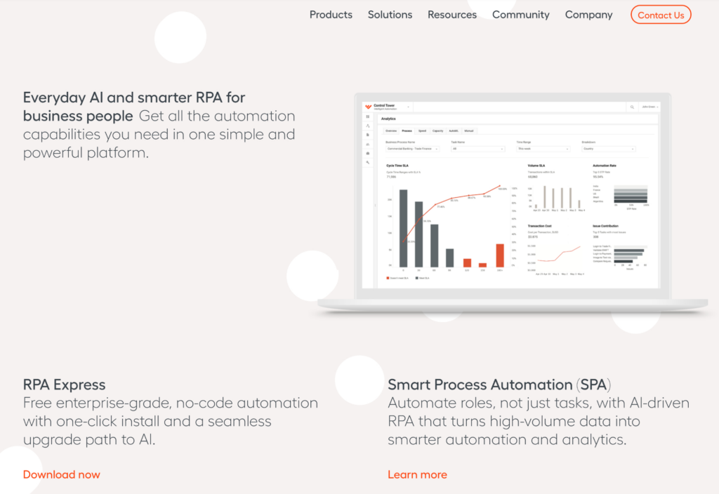
One of the main challenges with the previous website was that the company’s product offering was difficult to understand. The new content strategy was to create a language and content architecture that defined what WorkFusion was about on the homepage level.
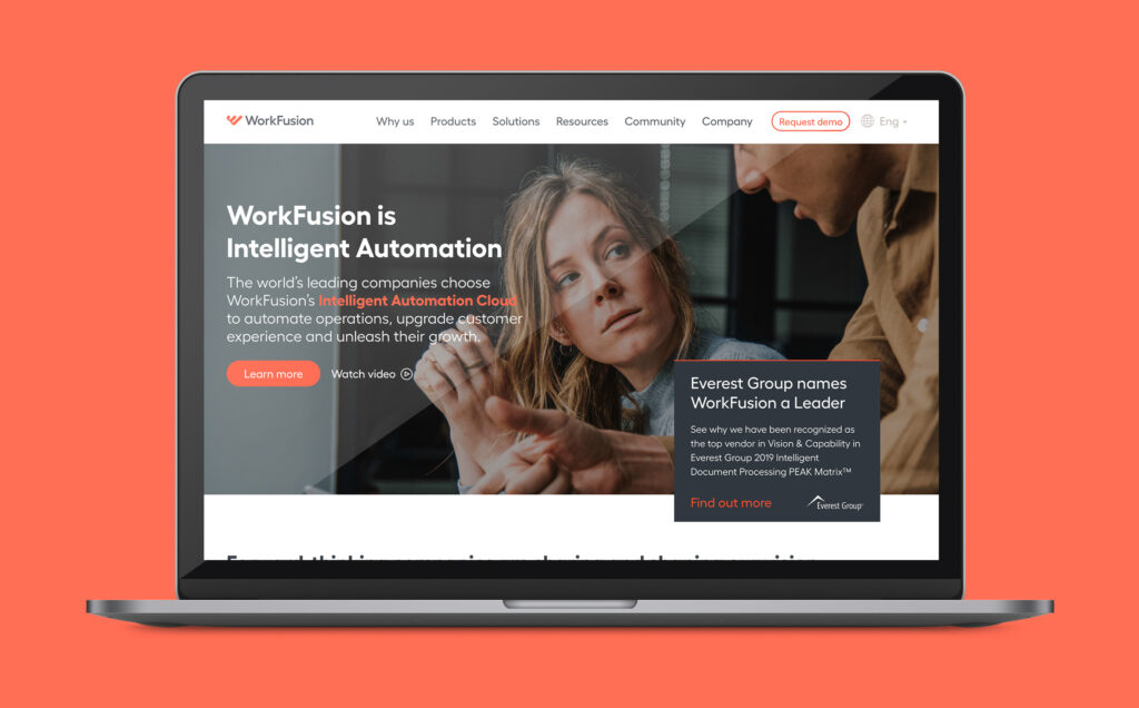
As machine learning and AI-powered capabilities were not widely understood at the time, it was important to create two distinct identities and user experiences for the company’s two automation software platforms (one with AI, one without). The user journeys were defined by accessible information sequencing and language that sounded powerful but was easy to grasp, coining (now widely used) terms like “Intelligent Automation” and Everyday AI”.
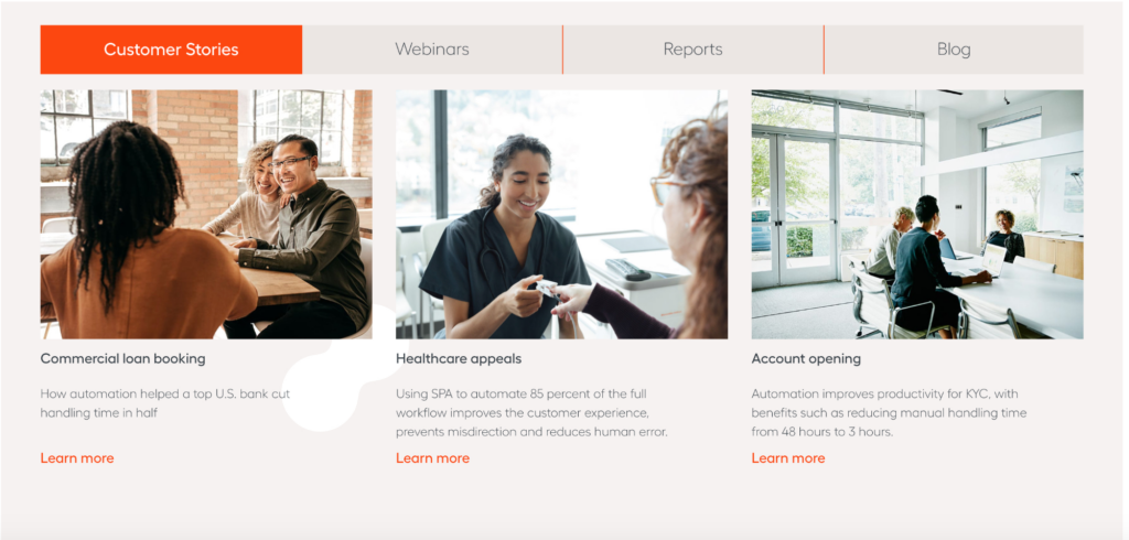
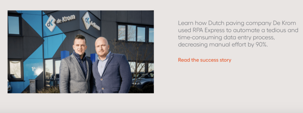
From abstract concepts to human experiences
Bringing in customers’ stories and voices served two crucial purposes. It provided a simple way of making complicated capabilities seem tangible and down-to-earth and it also showed in concrete terms how (terrifyingly) efficient the product was.