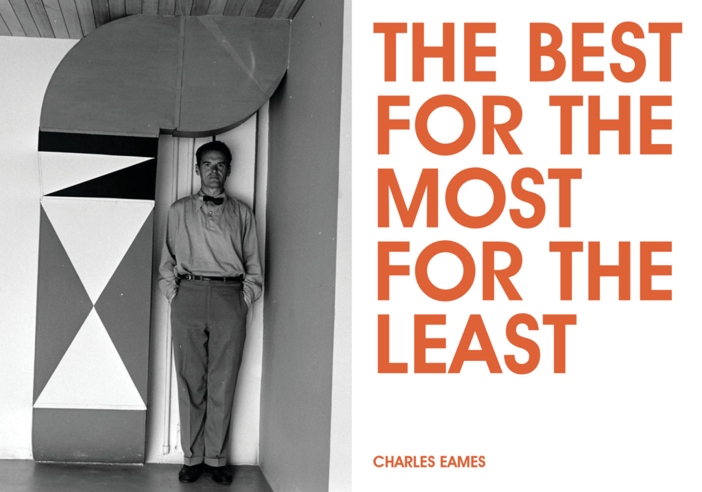
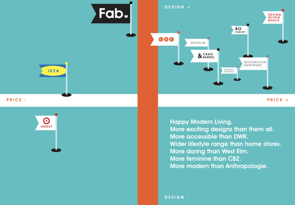
This is one of my favorite brand projects. I created it in my last year as Content Director for the flash-in-the-pan design shop Fab.com. After three years of explosive growth, the company had overextended itself and was experiencing an identity crisis. Together with our creative director PJ Mattan, I was tasked with putting together this book to remind the team of what made the brand special in the first place. The concept of “Happy Modern” came from a presentation I created, and this book grew from there.
What I did:
- Brand concept
- Positioning
- Brandvoice
- Copywriting
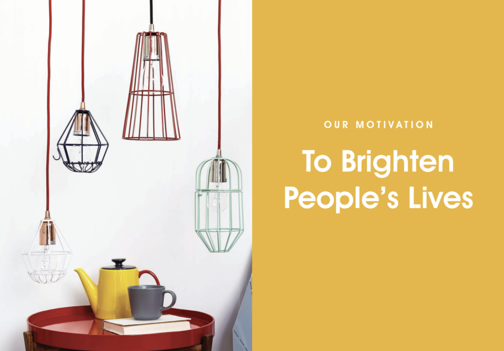
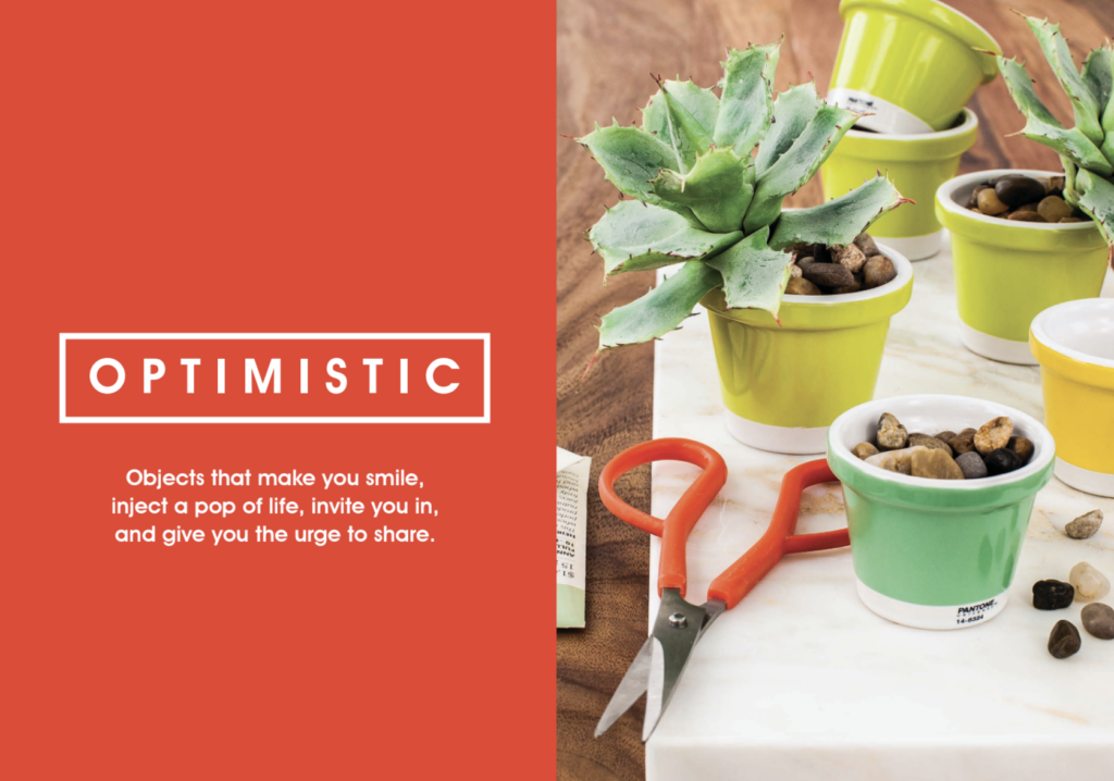
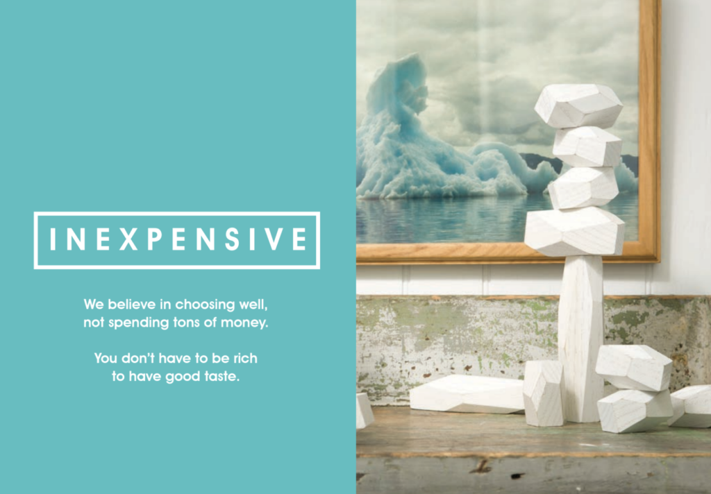
This was a project where copy and visuals were created together, which gave the positioning strength and clarity. Because the images and words worked in tandem, we could rely on bold and minimal gestures.
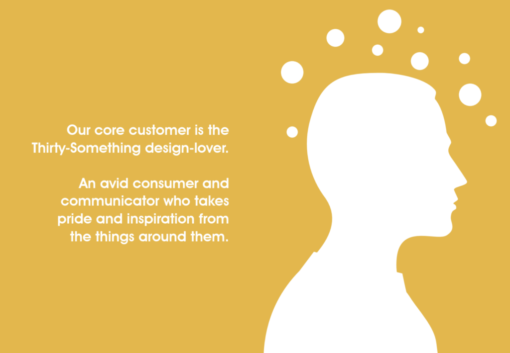
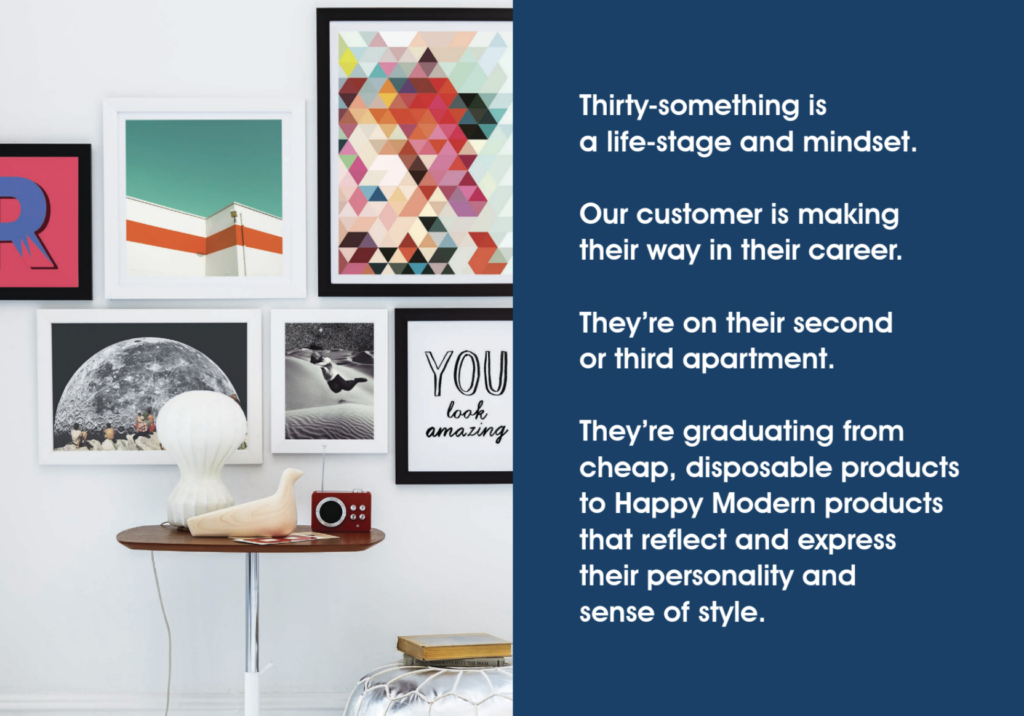
Understanding the brand’s purpose meant understanding its customers. We took the customer profiling data that had been collected and crystallized it into one main target group.
In hindsight, our positioning seems optimistic at best. But at least we presented it quite nicely.
